

This space system may work for you as well
I like coding but I also enjoy developing complex interfaces in Webflow. That's why everything I create should work across these two platforms.


Fundamental of this space system
I use margin to separate elements. This is an example of a <div> containing the class .space
<div class="space"></div>
Applying margin
Values for margin are not applied directly on .space. The class .space will combine with other classes to create space. These combinations are .space._top, .space._right, .space._bottom, and .space._left. I prefer using.space._bottom over .space._top, and .space._right over .space._left in order to find and modify spaces easily in the future.
You shouldn’t assign values to margin to these combinations yet as they will be rewritten; you’ll need another level of combination on top of the previous ones. This is what I call a variant.
Space variants
We'll just start with an example. The following snippets of code are based on a project that needs 12, 6, and 5 spacing variants distributed in 3 space systems. CSS works with 3 dimensions, and only 2 are affected by the margin property. In this case—you can do the math—we’ll need 92 combined classes.
The following snippet of code defines approximately 4.3% of the number of combined classes that we would need. That being said, we’ll need to focus on optimizing the code by not writing redundant lines.
.space._top.__m { margin: 16px 0 0 0 }
.space._right.__m { margin: 0 16px 0 0 }
.space._bottom.__m { margin: 0 0 16px 0 }
.space._left.__m { margin: 0 0 0 16px }
Within this space system, structures like ._word or .__word don’t contain properties by themselves. This also applies to the structure .space._word. Don’t make the mistake of using them.
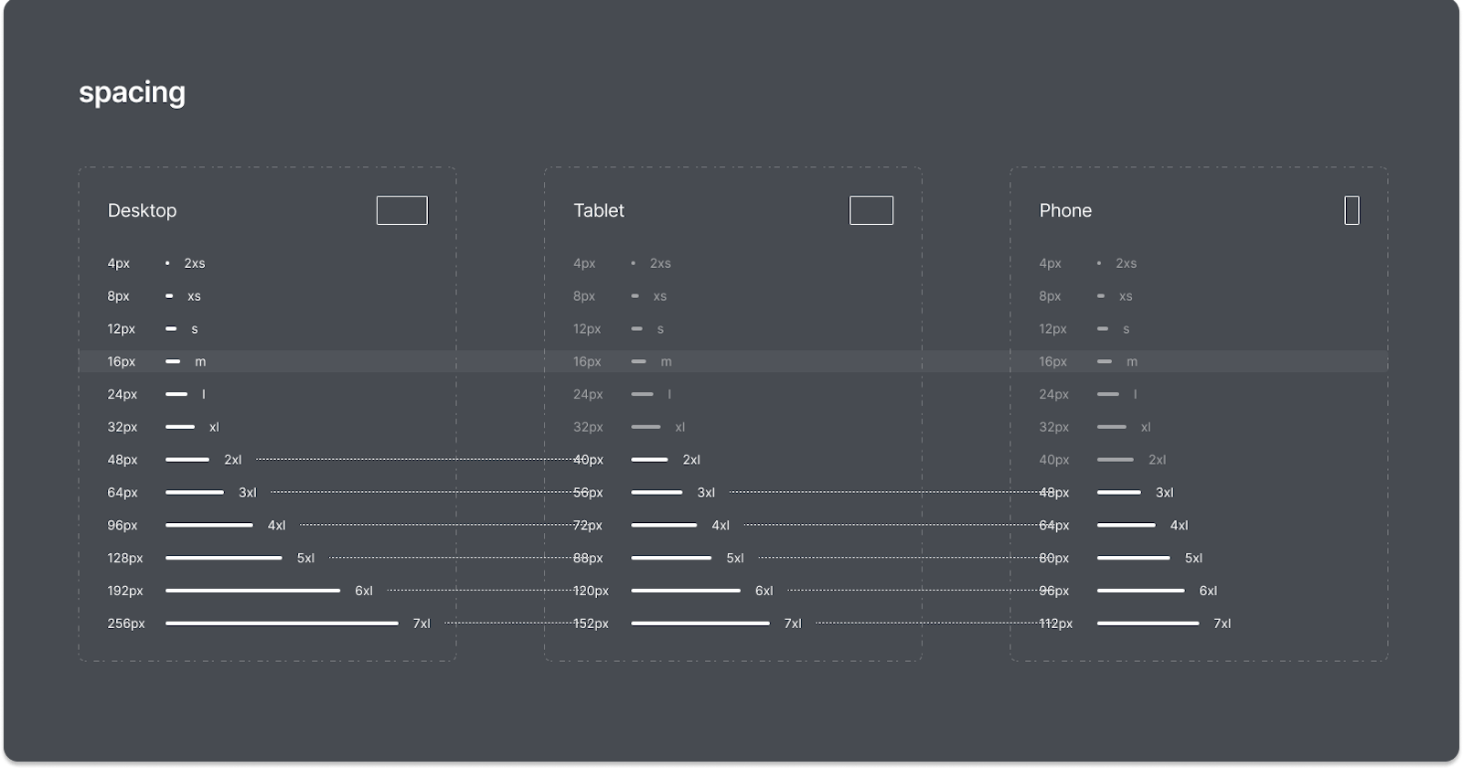
Creating variables to simplify combined classes across screen resolutions
It’s useful to create variables when you need the values to change depending on external factors such as what screen resolution the elements are being visualized from.
:root {
    --_2xs: 4px;
    --_xs: 8px;
    --_s: 12px;
    --_m: 16px;
    --_l: 24px;
    --_xl: 32px;
    --_2xl: 48px;
    --_3xl: 64px;
    --_4xl: 96px;
    --_5xl: 128px;
    --_6xl: 192px;
    --_7xl: 256px;
}
Then create your variables for the rest of the space systems. In this case, for screen resolutions under 991px and 767px.
:root @media screen and (max-width: 991px) {
    --_2xl: 40px;
    --_3xl: 56px;
    --_4xl: 72px;
    --_5xl: 88px;
    --_6xl: 120px;
    --_7xl: 152px;
}

:root @m*edia screen and (max-width: 767px) {
    --_3xl: 48px;
    --_4xl: 64px;
    --_5xl: 80px;
    --_6xl: 96px;
    --_7xl: 112px;
}
By defining variables, you can use nearly use 2/3 less code. So here is the result—a code ready to implement in every project
:root {
    --_2xs: 4px;
    --_xs: 8px;
    --_s: 12px;
    --_m: 16px;
    --_l: 24px;
    --_xl: 32px;
    --_2xl: 48px;
    --_3xl: 64px;
    --_4xl: 96px;
    --_5xl: 128px;
    --_6xl: 192px;
    --_7xl: 256px;
}

@media screen and (max-width: 991px) {
  :root {
    --_2xl: 40px;
    --_3xl: 56px;
    --_4xl: 72px;
    --_5xl: 88px;
    --_6xl: 120px;
    --_7xl: 152px;
  }
}

@media screen and (max-width: 767px) {
  :root {
    --_3xl: 48px;
    --_4xl: 64px;
    --_5xl: 80px;
    --_6xl: 96px;
    --_7xl: 112px;
  }
}

.space._top.__2xs { margin: var(--__2xs) 0 0 0 }
.space._right.__2xs { margin: 0 var(--__2xs) 0 0 }
.space._bottom.__2xs { margin: 0 0 var(--__2xs) 0 }
.space._left.__2xs { margin: 0 0 0 var(--_2xs) }

.space._top.__xs { margin: var(--_xs) 0 0 0 }
.space._right.__xs { margin: 0 var(--_xs) 0 0 }
.space._bottom.__xs { margin: 0 0 var(--_xs) 0 }
.space._left.__xs { margin: 0 0 0 var(--_xs) }

.space._top.__s { margin: var(--_s) 0 0 0 }
.space._right.__s { margin: 0 var(--_s) 0 0 }
.space._bottom.__s { margin: 0 0 var(--_s) 0 }
.space._left.__s { margin: 0 0 0 var(--_s) }

.space._top.__m { margin: var(--_m) 0 0 0 }
.space._right.__m { margin: 0 var(--_m) 0 0 }
.space._bottom.__m { margin: 0 0 var(--_m) 0 }
.space._left.__m { margin: 0 0 0 var(--_m) }

.space._top.__l { margin: var(--_l) 0 0 0 }
.space._right.__l { margin: 0 var(--_l) 0 0 }
.space._bottom.__l { margin: 0 0 var(--_l) 0 }
.space._left.__l { margin: 0 0 0 var(--_l) }

.space._top.__xl { margin: var(--_xl) 0 0 0 }
.space._right.__xl { margin: 0 var(--_xl) 0 0 }
.space._bottom.__xl { margin: 0 0 var(--_xl) 0 }
.space._left.__xl { margin: 0 0 0 var(--_xl) }

.space._top.__2xl { margin: var(--_2xl) 0 0 0 }
.space._right.__2xl { margin: 0 var(--_2xl) 0 0 }
.space._bottom.__2xl { margin: 0 0 var(--_2xl) 0 }
.space._left.__2xl { margin: 0 0 0 var(--_2xl) }

.space._top.__3xl { margin: var(--_3xl) 0 0 0 }
.space._right.__3xl { margin: 0 var(--_3xl) 0 0 }
.space._bottom.__3xl { margin: 0 0 var(--_3xl) 0 }
.space._left.__3xl { margin: 0 0 0 var(--_3xl) }

.space._top.__4xl { margin: var(--_4xl) 0 0 0 }
.space._right.__4xl { margin: 0 var(--_4xl) 0 0 }
.space._bottom.__4xl { margin: 0 0 var(--_4xl) 0 }
.space._left.__4xl { margin: 0 0 0 var(--_4xl) }

.space._top.__5xl { margin: var(--_5xl) 0 0 0 }
.space._right.__5xl { margin: 0 var(--_5xl) 0 0 }
.space._bottom.__5xl { margin: 0 0 var(--_5xl) 0 }
.space._left.__5xl { margin: 0 0 0 var(--_5xl) }

.space._top.__6xl { margin: var(--_6xl) 0 0 0 }
.space._right.__6xl { margin: 0 var(--_6xl) 0 0 }
.space._bottom.__6xl { margin: 0 0 var(--_6xl) 0 }
.space._left.__6xl { margin: 0 0 0 var(--_6xl) }

.space._top.__7xl { margin: var(--_7xl) 0 0 0 }
.space._right.__7xl { margin: 0 var(--_7xl) 0 0 }
.space._bottom.__7xl { margin: 0 0 var(--_7xl) 0 }
.space._left.__7xl { margin: 0 0 0 var(--_7xl) }